
This guide clarifies what “standard” means for modern readers and creators. We focus on practical measurements, handling, and design choices so you can pick a format that looks great and feels right.
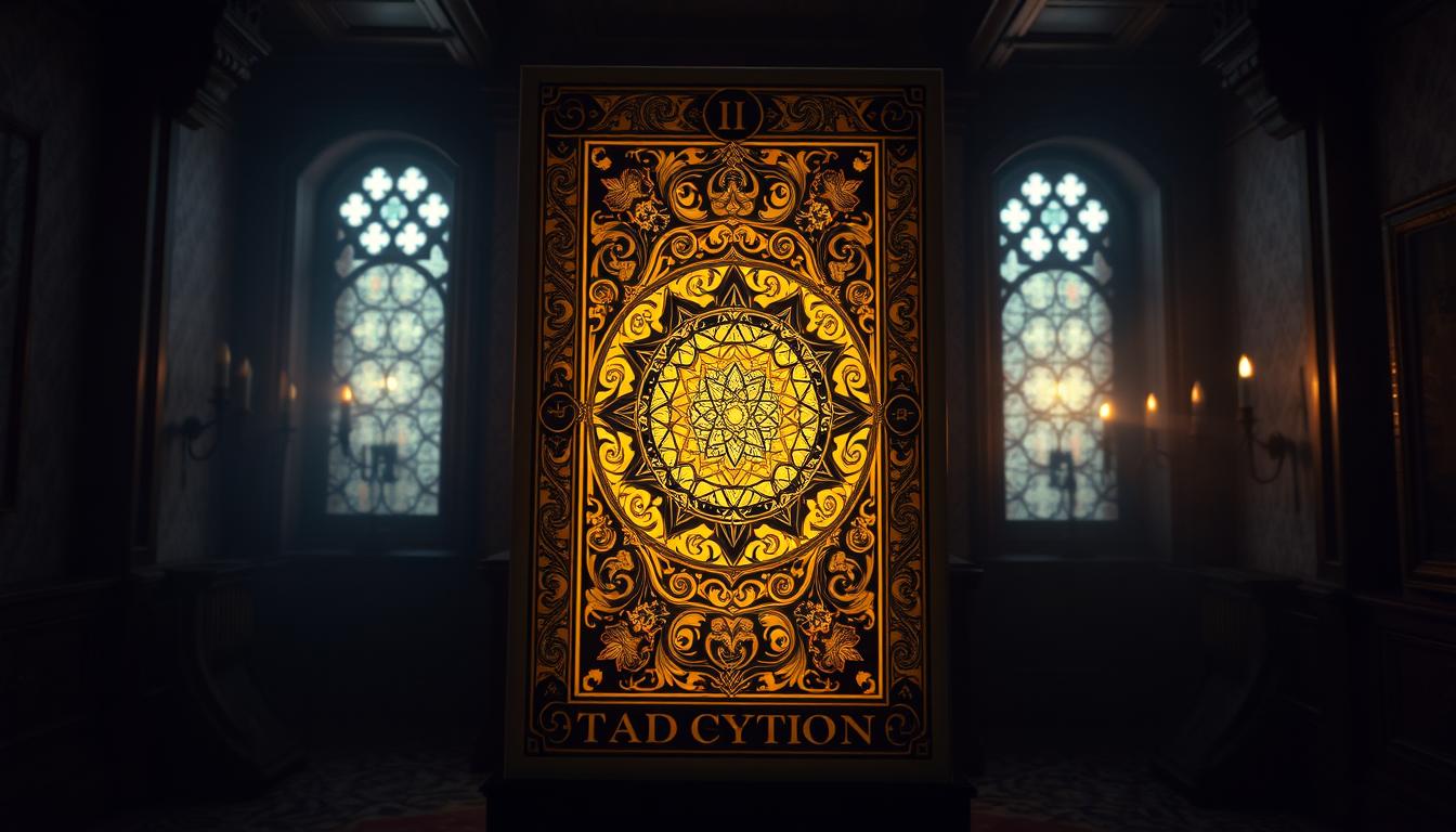
The de facto standard is 2.75″ × 4.75″, a balance of artwork visibility and shuffle comfort. That ratio also maps well to print setups near 900 × 1500 pixels at 300 DPI.
We will compare common formats like Jumbo, Poker, Bridge, and Pocket. You’ll learn how dimensions affect shuffling, table spreads, and long-session ergonomics. The guide also covers pixel templates, bleed and trim, corner radius, and how finishes and GSM change feel and durability.
Key Takeaways
- The typical modern standard is 2.75 4.75 for most decks.
- Dimensions influence readability, portability, and shuffle feel.
- Pixel templates and bleed settings matter for print-ready files.
- Material, core, and finish affect handling beyond mere measurement.
- Creators should prototype and order print samples before full runs.
What “tarot card size” means today
Most modern makers shorthand “tarot card size” to a familiar 2.75″ × 4.75″ rectangle, but the market is broader. That dimension balances artwork and handling, yet creators offer an array of formats to fit different hands, reading contexts, and visual goals.
Hand size and shuffle method shape many preferences. Overhand shufflers often like slightly narrower proportions, while riffle users accept wider faces. Session length also matters: long readings favor thicker stock and comfortable proportions for repeated handling.
Visual legibility changes with footprint. Larger surfaces reveal fine line work and rich symbolism. Smaller formats prioritize portability and quick, casual readings for on-the-go use.

Designers match format to setting—home spreads, travel, pro readings, or live events—so table space and lighting guide choices. Collectors may pick oversized decks for gallery-style artwork, while younger readers or those with small hands choose narrower, more secure formats.
- International printing norms and vendor offerings often determine rounding in inches or millimeters.
- Materials matter: identical footprints can feel very different when paper, cores, or finishes change.
- Think about consistency across guidebooks, boxes, and accessories when planning a product line.
For a quick reference on standard measurements, see this link to standard measurements. The rest of this guide helps translate your personal style and preference into confident sizing decisions.
Standard tarot measurements at a glance: 2.75″ × 4.75″
Choosing 2.75″ × 4.75″ gives artists room for detail while keeping decks comfortable to shuffle.
Why this footprint works: It’s wide enough to hold clear artwork and small motifs, yet narrow enough to shuffle reliably with most hands. That balance is why many creators call it the practical standard.
Thickness and finish matter: Many makers aim for 330–350 GSM as a middle ground for frequent handling. But perceived heft also depends on core and surface.

How core and coating change the feel
- Black-core stock prevents show-through and reads as more durable.
- Linen embossing adds tiny air pockets that improve glide for riffle and overhand shuffles.
- Soft-touch laminations feel luxurious but reduce slip; coatings add protection with less bulk.
| Feature | Typical Option | Effect on handling | When to choose |
|---|---|---|---|
| GSM | 330–350 | Balanced weight and flexibility | Frequent use, retail decks |
| Core | Black / white / grey | Opacity and edge strength | Prevent show-through or enhance durability |
| Finish | Linen / soft-touch / gloss | Slip and tactile feel | Prefer glide, luxury, or vibrant color |
| Print pixels | ~900 × 1500 at 300 DPI | Sharp artwork reproduction | Design and preflight files |
Pro tip: order prototypes. One format with different cores and finishes can feel like entirely separate decks in hand. For a quick check of common working measurements, see this working measurements.
Tarot card size compared to playing cards and bridge cards
For everyday use, comparing poker and bridge formats to taller decks reveals clear trade-offs in portability, legibility, and shuffle feel.

Poker (2.5″ × 3.5″) fits compact hands and fast riffles. It is easy to store and uses many standard printers’ dies. Style that is bold and graphic often reads well at this footprint.
Bridge (2.25″ × 3.5″) is narrower and helps those with smaller hands or tight overhand shuffles. It reduces hand strain during long sessions and works well where space is tight.
Poker size vs. tarot size for everyday use
Compare Poker to the taller 2.75″ × 4.75″ format: Poker is quicker to shuffle, while the taller format gives more surface for titles and intricate imagery.
“Larger faces reduce eye strain and make shared readings easier across a table.”
Bridge size and pocket decks for smaller hands
Pocket options (~2.25″ × 3.85″) strike a balance for travel and small altars. They stay readable without adding bulk to a bag.
- Practical example: riffle and bridge shufflers often prefer narrower decks for speed.
- Beginners teaching groups benefit from taller formats for shared visibility.
- Printers may favor Poker/Bridge dies, which can lower cost and speed turnaround.
| Format | Typical dims | Best for |
|---|---|---|
| Poker | 2.5″ × 3.5″ | Quick shuffles, compact storage |
| Bridge | 2.25″ × 3.5″ | Small hands, tight overhand shuffles |
| Taller decks | 2.75″ × 4.75″ | Detailed artwork, shared readings |
Test before you print: prototype Poker, Bridge, and taller formats to compare shuffle speed, readability, and table footprint.
Beyond standard: large, jumbo, mini, and pocket decks
When you move past the common footprint, each format answers a different need: display, travel, or daily practice.

Large and jumbo for detail-rich artwork and display
Common large formats include 3.5″ × 5″ (oracle style) and 3.5″ × 5.5″ (jumbo). These give painters and illustrators extra canvas for texture, metallic foil, and spot gloss.
Pros: excellent readability in group workshops and gallery-style presentation. Cons: longer shuffles can tire hands and require sturdier boxes.
Mini and pocket for travel and quick readings
Mini decks (~1.75″ × 2.875″) and pocket formats (~2.25″ × 3.85″) are ideal for daily draws, discreet readings, and EDC pouches.
- Minis shuffle fast but can feel “flicky” in hand.
- Pocket versions balance portability with legibility.
- Packaging: tins and slim tuck boxes save space; jumbo needs robust cases.
Design tip: bold, graphic artwork holds up at small scales, while intricate watercolor benefits from jumbo canvases. Test finishes—gloss can glare on large prints; soft-matte helps grip minis.
| Format | Typical dims | Best use |
|---|---|---|
| Jumbo | 3.5″ × 5.5″ | Display, collectors, detailed artwork |
| Oracle/Large | 3.5″ × 5″ | Workshops, art-forward decks |
| Pocket/Mini | 1.75″×2.875″ – 2.25″×3.85″ | Travel, daily draws, EDC |
“Match the physical format to how the deck will be used — display, travel, or main working deck.”
Choosing the right size for your tarot deck and reading style
Pick the footprint that matches how and where you read most often.
Start with a primary scenario: daily personal draws, client sessions, classes, or travel each point toward a different format. Narrow widths help smaller hands and tight overhand shuffles. Larger formats improve visibility for teaching or display.

Consider feel and durability: many creators prefer 330–350 GSM with a protective coating as a practical balance for frequent handling. Heavier builds feel premium but can tire you in long sessions; lighter decks shuffle faster.
- Match typography to footprint — small formats need crisp fonts and strong contrast.
- Account for table space when planning spreads and guidebooks.
- Prototype two or three formats with sample prints before committing to production.
Think about audience and brand: beginners often do well with a standard tarot deck at moderate GSM and a smooth or satin finish. Align the final format with packaging and accessories to create a cohesive experience.
For a practical comparison and a related reference, see this four-of-swords guide.
Materials matter: cardstock, cores, GSM, and finishes
Material choices drive how a deck handles, looks, and lasts. The build you pick affects shuffle feel, opacity, and longevity more than raw dimensions.

Cardstock vs. art paper
Cardstock (coverstock) usually includes a core. It is engineered for repeated shuffling and edge strength.
Art paper is coreless and often thicker for display pieces, but it can wear faster under heavy use.
Core types and why they matter
Core choices run grey → white → blue → black. Black core gives the best opacity and resists show-through, which is why many casino-quality playing stock uses it.
GSM and the shuffle–flex tradeoff
300–320 GSM feels lighter and very flexible. 330–350 GSM is the common working range that balances durability and shuffle ease.
395–400 GSM reads as substantial but can be stiff for long sessions.
Finishes and coatings
Laminations (matte, gloss, soft-touch) add protection and change slip. Linen embossing boosts glide and hides scuffs. Aqueous coatings are more eco-friendly than UV or varnish and still resist scuffing.
| Component | Typical Option | Effect | When to choose |
|---|---|---|---|
| Stock | Cardstock with core / art paper | Durability vs. display look | Working decks vs. gallery pieces |
| Core | Grey / White / Blue / Black | Opacity and edge strength | Prevent show-through for frequent use |
| GSM | 300–400 | Flex vs. heft | 330–350 for balanced handling |
| Finish | Linen / Matte / Gloss / Soft-touch | Slip, grip, and tactile feel | Choose by shuffle method and branding |
Pro tip: order printer sample packs. Finish, core, and GSM can make identical sizes feel like different products. Test before full production.
Oracle and alternative sizes: when to go 3.5″ × 5″
Choosing 3.5″ × 5″ often comes down to space for text and wide imagery. This footprint gives creators room for affirmations, short prompts, and expansive artwork without crowding the layout.

Flexibility matters: Unlike the fixed 78-card tradition, many oracle decks let you pick any count and any format. That freedom makes it easy to tailor a deck to theme and audience.
Alternative shapes and handling
Square and oval options—for example 3″ × 3″ squares or ~3.08″ × 5.5″ ovals—work well for rotating spreads and visual storytelling that breaks from rectangles.
- Test typography and icon scale at 3.5″ × 5″ so text-heavy prompts stay legible in quick pulls.
- Large formats need sturdier magnetic boxes and thicker guidebook spines for safe storage.
- Full-bleed artwork demands careful bleed setup and corner-radius planning to avoid cropping key elements.
- Finish choice affects glide: glossy or linen for smooth fanning; matte/soft-touch for a slower, contemplative pull.
| Feature | Common Option | Why it matters |
|---|---|---|
| Format | 3.5″ × 5″, square, oval | Visual room for text, different handling styles |
| Count | Flexible (10–60+) | Match concept and audience attention span |
| Packaging | Magnetic box / slipcase | Protects larger decks and thicker guidebooks |
Pro tip: mix oracle and tarot cards in a spread by making their formats distinct. That visual cue helps readers separate roles at a glance. For a related reference on sizing choices, see this working example.
Digital and print templates: pixels, bleed, and file setup
A reliable template keeps artwork aligned and prevents costly reprints. Start with a high-resolution master and confirm the printer’s dieline before finalizing layouts.

Pixel canvas: for the common 2.75 4.75 format, set your working file near 900 × 1500 pixels at 300 DPI. That preserves crisp lines and readable type when you export for print.
Bleed and safe area: add at least 0.125″ bleed on all sides. Keep titles, numbers, and focal symbols inside the safe area so nothing important is trimmed away.
Trim, corner radius, and export essentials
Match the printer’s corner radius and request dielines early. Coatings and laminations can change perceived thickness, so confirm specs before the final run.
“Export press-ready PDFs with embedded fonts or outlined type and use the printer’s CMYK profile.”
- Use consistent margins and border thickness across the set to avoid visual drift.
- Design backs symmetrically so shuffling won’t reveal faces.
- Batch-check full-bleed edges for consistent trims on borderless art.
- For digital decks, preserve the aspect ratio when scaling down from hi-res masters.
| Task | Recommended spec | Why it matters |
|---|---|---|
| Canvas | ~900 × 1500 px @300 DPI | Sharp artwork and readable type for printing |
| Bleed | 0.125″ per side | Prevents white slivers after trim |
| Safe area | Keep critical elements 0.125″ inside trim | Avoids accidental cropping of text and symbols |
| Export | PDF/X, CMYK, embedded fonts | Printer-ready files reduce color and layout issues |
| Dielines & corners | Use printer dielines and match corner radius | Prevents misalignment and box-fit problems |
Pro tip: keep layered source files organized per item for fast edits during the proofing process. This streamlines the design → print process and reduces turnaround time.
Production tips: from design to deck
Plan production with clear priorities so design choices match budget and use.

Balancing cost and usability matters. Larger formats and premium finishes raise per-unit price and postage. Black-core cardstock with a linen or coated finish around 330–350 GSM gives many creators a durable working deck that still shuffles well.
Balancing size, usability, and budget
Start with a firm budget and the main way the deck will be used. Choose two to three format and finish combos to test.
Test prints and samples to refine your card size and finish
Order printer sample kits and run backlight tests to check show-through. Do real-world trials: spreads, riffle and overhand shuffles, and mock client sessions. That uncovers fatigue, glare, and edge wear before a full run.
- Shortlist combos and print test runs to compare color and handling.
- Verify packaging: box style, inserts, and protection for shipping.
- Request spec sheets from multiple vendors and compare GSM, core, and finishes.
- Plan QC: check color consistency, corner rounding, and collation before sealing.
| Step | Action | Why it matters |
|---|---|---|
| Budget planning | Set per-unit and shipping targets | Informs format, finish, and run quantity |
| Sample testing | Order sample kits and pilot runs | Catches trim, registration, and coating issues |
| Handling trials | Shuffle and spread in real sessions | Reveals comfort and durability problems |
| Documentation | Save dielines, profiles, and specs | Simplifies reorders and vendor communication |
Pro tip: build time for a pilot run. It reduces costly fixes later and helps you make tarot the way you envision it. For more on setup and practical steps, see how to become a telephone psychic.
Real-world examples: popular tarot card sizes by deck
Concrete examples make it simple to compare how popular decks feel in hand.
Benchmark: Rider-Waite is 2.75″ × 4.75″, a reference for readability and shuffle comfort across generations.
Thoth runs about 2.875″ × 4.375″, giving a slightly narrower feel while keeping tall proportions. The Wild Unknown uses the same standard as Rider-Waite, which helps modern readers expect consistent handling.

Modern Witch expands to roughly 3″ × 5″ for a bolder canvas. A Pocket Rider-Waite clocks near 1.75″ × 2.875″ for portability and quick daily draws.
| Deck | Typical dims | Use |
|---|---|---|
| Rider‑Waite | 2.75″ × 4.75″ | Standard readability |
| Thoth | 2.875″ × 4.375″ | Narrower, tall feel |
| Modern Witch | 3″ × 5″ | Bold artwork |
| Pocket Rider‑Waite | 1.75″ × 2.875″ | Travel, daily draws |
Quick reference roll-up: Oracle 3.5″×5″, Jumbo 3.5″×5.5″, Bridge 2.25″×3.5″, Poker 2.5″×3.5″, Pocket 2.25″×3.85″, Trump 2.45″×3.95″.
“Small deviations—corner radius, title length, or border—can change hand feel and storage fit.”
Compare these examples to your audience and reading environment. Build a small physical library and test how each deck shuffles, fans, and lays in spreads. For quick technical reference see standard measurements.
Conclusion
When you choose a deck format, think about how you will use it every day. The standard 2.75″ × 4.75″ is a reliable baseline, with alternatives like Poker, Bridge, Pocket, and Jumbo to match different needs.
Materials matter as much as measurements. Core, GSM, and finish shape how cards glide, resist wear, and feel in long sessions. Test prototypes and compare handling before you print a full run.
Practical next steps: define the main use case, shortlist two formats and finishes, and order short-run samples. For related reading and inspiration, see seeing angel numbers.
Keep iterating: collect feedback, refine your design, and align files to printer specs so your artwork and deck shine in the hands of others.
FAQ
What does "tarot card size" mean today?
It refers to the physical dimensions and proportions used for modern decks, balancing artwork area with ease of handling. Designers pick a format that supports their visuals while allowing comfortable shuffling and fanning.
Why is 2.75" × 4.75" considered the standard?
That proportion gives enough room for detailed artwork yet stays narrow enough for smooth shuffles. It’s a common compromise used by many mainstream publishers and independent creators.
How do thickness and finish affect handling at this standard measurement?
Heavier stock and textured finishes make cards stiffer and easier to riffle, while thinner stock with glossy coatings can feel flimsy but lay flat for spreads. Choose based on shuffle style and longevity needs.
How does this format compare with poker and bridge decks?
Poker decks are wider and shorter, so they’re easier to hold for games. Bridge (narrower) and pocket formats suit smaller hands and travel. The standard listed above sits between those for art and function.
When should I choose large or jumbo formats?
Pick larger formats when artwork detail or display matters, such as gallery-style decks or wall grids. They enhance visual impact but reduce portability and increase production costs.
What are the benefits of mini and pocket decks?
Minis save space, lower production costs, and work well for travelers or those who prefer quick readings. They sacrifice some image detail and can be harder to shuffle for users with larger hands.
How do cardstock, cores, and GSM influence feel and durability?
Cardstock weight (GSM) affects stiffness and longevity; cores—grey, white, or black—impact opacity and bending memory. Higher GSM and quality cores resist wear but make decks heavier and costlier.
Should I choose matte, gloss, soft-touch, or linen finishes?
Matte and soft-touch reduce glare and give a premium feel. Gloss adds vibrancy but shows scratches. Linen offers texture for grip and shuffling. Match finish to how the deck will be used and handled.
When is a 3.5" × 5" or alternate shape a good choice?
Larger rectangles, squares, or custom cuts suit oracle-style decks, rule-breaking art, or tactile novelty. Use them when you want a distinct experience or larger reading spread visuals.
What pixel dimensions and DPI should I use for print templates?
For a standard rectangle at 300 DPI, aim for roughly 900 × 1500 pixels. Include 1/8″ bleed and safe margins, and set corner radii to match your printer’s specifications for clean edges.
How much bleed and corner radius do printers typically expect?
Most print shops ask for 1/8″ (3 mm) bleed; corner radius commonly ranges from 3 mm to 6 mm. Always confirm with the manufacturer before finalizing files to avoid trimming issues.
What’s the best process for testing size, finish, and feel before full production?
Order single-card mockups and small samples with intended stock and coating. Test shuffling, fanning, and lay-flat performance. Adjust dimensions, GSM, or finish based on real-use feedback.
How do production costs change with larger or custom formats?
Bigger panels and unique cuts raise material and die-cut costs. Specialty coatings and higher GSM add price. Budget for tooling, proofs, and potential extra rounds of revisions.
Can I use standard playing card templates for art decks?
You can, but tailor templates for bleed, spine artwork, and rounded corners. Poker templates often differ from art-focused rectangle templates, so adapt layout guidelines accordingly.
Which popular decks illustrate common format choices?
Many mass-market decks use the 2.75″ × 4.75″ format; oracle decks like those from Hay House or Llewellyn often pick larger rectangles or square shapes to showcase art and text.